How can customers contact your business if a web form is difficult to use?
Give customers a usable form and another staffed way to reach you. Then test the whole path, from finding the details to receiving a useful reply.
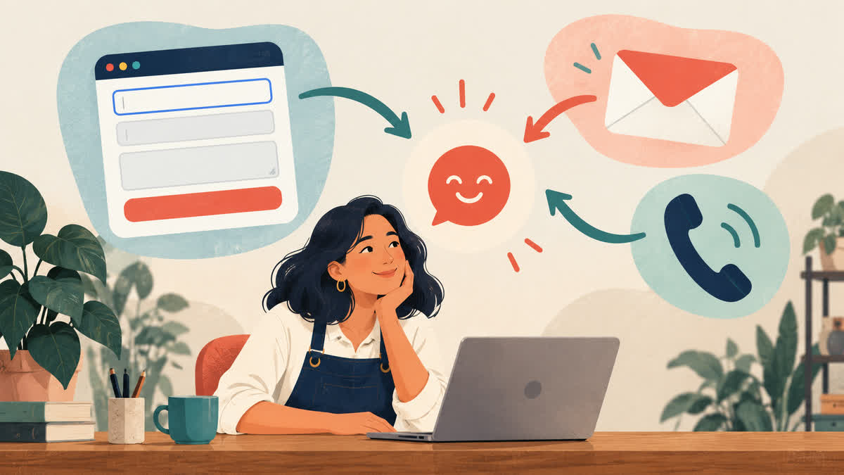
Imagine a prospective customer who has read your service page and wants to ask a question. The contact form will not submit with their keyboard. The only alternative is a phone number, but calling is difficult for them. They should not have to solve your website to reach your business.
Give people more than one workable way to make contact, and make every option you publish a real route to a reply. An email address cannot rescue an inaccessible form if nobody checks that inbox. A phone number is not a universal accessibility solution either. The useful combination depends on what your team can answer, when, and in which language.
This guide focuses on the contact path: how someone finds an option, sends an inquiry, gets confirmation, and receives the next step. Our booking accessibility guide covers the more specific task of choosing and confirming an appointment.
The evidence describes a gap, not your customers
In Statistics Canada’s corrected account of the Canadian Survey on Business Conditions, 26.7% of Canadian businesses and organizations that used virtual communication reported providing accessibility features for it in the preceding twelve months, as reported in the fourth quarter of 2025. The underlying table includes virtual communication broadly; it is not a test of contact forms, a count of accessible websites, or an Ottawa–Gatineau result. Statistics Canada corrected the survey weights after the initial release. The figure describes reported practice, not the number of customers a particular business could gain by changing its page.
The practical question is smaller: can a person with a different device, input method, communication preference, or language need reach your team and know what happens next? Test that directly.
Make the choices easy to find and understand
Put contact options where a customer will look for them: a clear Contact link in navigation, a relevant next step on service pages, and contact details on the contact page itself. Label links by destination or action. “Email our team” tells more than “Click here.” If the business has a physical location, explain whether visits require an appointment rather than assuming the address is an invitation to drop in.
For each channel, state what it is for. A bookkeeping practice might say that its general inbox handles new service inquiries while existing clients should use their established secure channel for records. It can name the broad topics a new customer may ask about without inviting tax documents or account numbers through a public form. This is especially useful when an inquiry moves between a website and a professional service workflow.
Do not advertise a channel your team cannot maintain. If you offer voicemail, say when it is monitored and how a caller can request a different reply method. If you publish an email address, assign someone to the inbox and arrange coverage during absences. A contact page is only as accessible as the response path behind it.
Make the form a usable option
Keep a first-contact form short. Ask for the details needed to route a reply: a name or business name if useful, a way to respond, a broad service need, and the question. Allow the customer to explain a contact preference in plain language. Do not force a phone number when email is a workable reply channel, or force a category that does not describe the inquiry.
W3C’s form guidance recommends clear labels, instructions, and feedback. A placeholder that vanishes as someone types is a poor substitute for a visible label. Mark required fields clearly. If a person enters an unexpected phone or postal-code format, explain the problem and accept reasonable variations rather than making them guess the exact punctuation your form expects. W3C’s validation guidance also calls for errors a person can find and correct; server-side validation is still needed even when the browser checks a field.
After submission, show a confirmation that actually means the message was received. State the next step and the channel the team will use. If the form fails, show an understandable error and keep what the person entered where possible. Include a different contact route beside the error. A successful button animation without a delivered message is not a successful inquiry.
Offer alternatives that do different jobs
Email, phone, and a form can complement each other. Email can help someone who needs time to write or uses a tool to compose text. Phone can help someone who would rather speak than fill in fields. Neither works for everyone. The goal is a choice, not a hierarchy where one method is the “accessible” one and the others are neglected.
Give the alternatives equal clarity. An email address should be selectable and readable, with a subject suggestion only if it helps staff route the note. A phone number should be text, not buried in an image, and should include useful hours or voicemail instructions. If you cannot offer live phone coverage, say so. If you accept inquiries in English and French, make sure staff can reply in the language the page promises; a French button that leads to an English-only reply is an operational gap.
Consider how someone can ask for a different communication format or method. A short sentence such as “If these options do not work for you, tell us how you would prefer to communicate” can help, provided there is a way to send that request. Do not ask someone to disclose a diagnosis to justify a different format. Route the request to a person who can respond and record the preference only as needed for the interaction.
Test the full path with a real task
Use a fictional inquiry so nobody’s customer information enters a test. Start on a service page and try to reach the team without a mouse. Check that focus stays visible, controls have names, and the form can be submitted and corrected with a keyboard. W3C’s preliminary accessibility checks explain how to inspect labels, keyboard access, and errors. Repeat at a narrow phone width and with enlarged text. An automated checker can flag some problems, but it cannot confirm that a person receives a useful reply.
Then test the operation. Send the fictional message through each published channel. Confirm it appears in the right inbox or queue, someone owns the reply, and the confirmation says what actually happens. Deliberately make a form error. Try the alternative link when the form is unavailable. Ask a fluent reviewer to complete the path in French if your business offers French inquiries. If a phone call requires a different response method, check that staff know how to arrange it.
Write down any failure with its owner and fix it before adding more contact features. A simple, staffed email path can be a better first improvement than a more complex form whose messages get lost. A business that receives sensitive documents will also need a separate, appropriate transfer process; the public contact page should explain where that handoff begins without collecting records on first contact.
When to ask for help
A website designer or developer can help connect labels to controls, make error messages perceivable, preserve input after a failed submission, and check the layout and keyboard path across devices. Your team still needs to decide who answers, which information belongs in a first inquiry, and which languages it can support. Those decisions make the technical work meaningful.
If your contact page is sending people into a dead end, start by tracing one inquiry from the service page through to a reply. Red Comet Media can help plan and build a clearer business website and contact path around that task.
Sources
- Statistics Canada, How businesses and organizations may be communicating with persons with disabilities and Table 33-10-1083-01. The article notes the corrected survey weights.
- W3C Web Accessibility Initiative, Forms Tutorial and Validating Input.
- W3C Web Accessibility Initiative, Easy Checks: A First Review of Web Accessibility.