How do you write alt text for small-business website images?
Describe the image’s job on the page: give useful details for informative photos, name the action for linked images, and leave purely decorative images quiet.
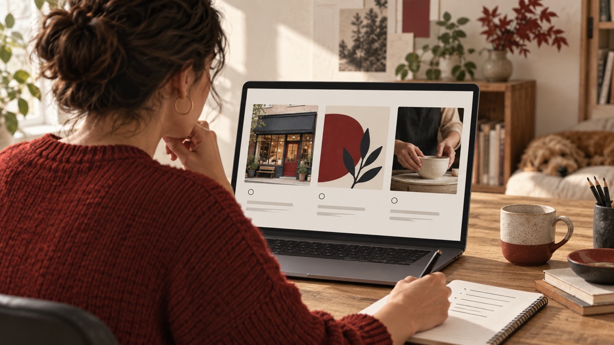
A business owner uploads a photo of the shop entrance, a service image, and a decorative pattern. The publishing tool offers the same little “alt text” box for each. What should go in it? The answer depends on what each image does on the page.
Write alternative text that gives someone who cannot see the image the information or action they would otherwise miss. For a meaningful photo, describe the relevant detail in the context of the page. For an image that acts as a link, name the destination or action. For purely decorative artwork, use an empty alternative (alt="") so it does not interrupt the reading order. A chart needs its key message and the underlying information in text nearby, not a label that merely says “chart.”
This is a practical publishing task, not a search-ranking trick. In WebAIM’s February 2026 audit of the home pages of one million highly ranked websites, 53.1% of sampled home pages had at least one image with missing alternative text. WebAIM used its WAVE engine on rendered pages. Its sample is not a count of Canadian small-business sites, and an automated check cannot judge whether existing alt text actually explains an image well. WebAIM also provides accessibility services, so read the figure as a documented audit finding, not as a prediction about your visitors or a return from fixing alt text.
Start with the image’s purpose
Ask what a visitor would lose if the picture were unavailable. The W3C Web Accessibility Initiative’s images tutorial separates informative, decorative, functional, and complex images because they need different text alternatives. The same photograph can need different wording on different pages. A shopfront photo on a contact page may help someone recognize the entrance; on an unrelated design mood board, it may only set a tone.
Read the sentence before and after the image. If the text already gives the same information and the image adds nothing, an empty alternative may be right. If the image carries a fact, instruction, or service detail absent from the page, write that detail in ordinary language. Do not force a visual description into a short alt field when the information belongs in the page’s visible text too.
Use the actual image, not the filename or a stock-photo caption, as your source. Avoid guessing a person’s identity, feelings, location, or circumstances. If a photo is an illustrative concept rather than your real premises or team, make the surrounding page clear about that; alt text should not turn a concept into a documentary claim.
Describe informative photos with useful specifics
Suppose an Ottawa repair shop uses a photo to show the accessible entrance at the side of its building. “Building” is too vague for the job. A useful alternative might be: “Side entrance beside the parking area, with a level approach and a red door.” The business must check that every detail is true of the photograph and current premises. If the entrance matters to a visit, give the address and access instructions in visible page text as well.
For a service photo, ask what decision the picture supports. If a bookkeeper’s site uses an image of a person sorting receipts simply to create atmosphere, a description of every object on the desk adds little. If the image demonstrates a specific step in a process, identify that step. Write a short phrase or sentence in the page’s language, then read it aloud after the adjacent heading. If it sounds repetitive or like a list of search terms, revise it.
The image’s visual appearance can matter when it is the subject: an artist’s portfolio, a product colour, or a visible feature of a location. Include those details when they help someone understand the offer. “Photo of” and “image of” usually add nothing because assistive technology already identifies an image. Avoid promises such as “fully accessible entrance” unless the business has verified the actual facilities and the phrase is necessary to the page.
Treat linked images as controls
A picture inside a link has a second job: it must tell someone where the link goes. If a card is only an image that opens your accounting services page, “Person at a laptop” does not explain the action. “Explore accounting website services” does. If the card already has a visible linked heading that supplies the same name, developers can avoid making a screen reader announce the same destination twice. Review the entire link, not just the image field.
The W3C functional-images guidance says the alternative for an image used as a button or link should convey its function. A phone icon beside the visible words “Call the office” can be decorative. A phone icon that is the only label for a call button needs an accessible name that explains the action. Check it with a keyboard and a screen reader if available, because a content editor may not control how the site builder combines image and link labels.
Leave decorative images quiet
A background flourish, divider, or repeated texture may add visual character without adding information. For an HTML image used only that way, W3C recommends a null text alternative: alt="". That is different from omitting the attribute, which can cause some assistive technologies to announce a file name or URL. Some site builders offer a “decorative” switch instead of showing the HTML; confirm what it publishes.
Do not mark an image decorative just because it is attractive. A logo that identifies the business, an icon that alone conveys a status, or a photo that shows how to find a door still carries meaning. Equally, repeating “Red Comet logo” in every decorative use of a mark can make a page tiring to listen to. Decide based on the image’s role in that place.
Put chart meaning in page text
For a simple chart, write a short alternative stating the subject and main point, then put the actual figures, labels, units, period, and source in nearby text or a table. For a floor plan or process diagram, explain the route or sequence in the page. W3C’s complex-images guidance calls for a complete text equivalent of the information, not a long, cramped alt attribute. The same visible explanation also helps people scanning on a phone or using a narrow connection.
If the chart is a decorative restatement of figures already in a nearby table, it can have a brief alternative that points to that information. If it introduces data the page never states, add the data before publishing. A generated chart image is no substitute for checking its numbers and source.
Check the published page, not just the upload form
Make a short image inventory for the pages that matter most: home, service, contact, booking, and any page with a diagram or gallery. For each image, note its purpose, the visible context, the alternative text or decorative setting, and who can update it. Start with images that act as the only link to a service or carry instructions people need to act.
Then inspect the rendered page. Temporarily turn images off or use a browser accessibility inspector to read the image names in order. Follow linked cards with a keyboard. Ask a person using a screen reader to review important journeys when possible. Automated checks are useful for finding missing attributes, but they cannot tell whether “friendly team helping you” honestly describes a real photo or whether an empty alternative hides an essential instruction.
When the site has English and French pages, review each image in its page language and context. The same image may need different wording if the surrounding content or action differs. Translate the meaning with a human review; do not paste an English alt description into a French page and call the journey complete.
Finally, make image review part of normal content maintenance. When a service photo, linked destination, entrance, or chart changes, revisit the alternative and the visible copy together. Google’s image guidance also recommends useful, contextual alt text and warns against keyword stuffing. That may help search systems understand an image, but neither Google nor WebAIM promises a ranking or customer outcome from an alt-text edit.
If your current website has images that carry service or contact information and the content editor cannot tell how they are announced, discuss a clearer website with Red Comet. We design and develop business websites and can plan the images, page copy, and interaction together.
Sources
- WebAIM, The WebAIM Million: 2026 report, February 2026 audit of rendered home pages, sample and method on the same page.
- W3C Web Accessibility Initiative, Images Tutorial, including linked guidance for functional, decorative, and complex images.
- Google Search Central, Image SEO best practices, image and alternative-text guidance.